Creating an End to End Application for Milestone
Project Overview
Milestone is a new company aiming to provide a resource for climbing gyms that allows their patrons to connect directly with them to book classes and also the climbing walls. Currently, in order to accomplish this, climbers may have to use multiple apps or the gyms websites. If a training board or other apps are used that could be an average of three applications just to enhance their experience at the gym or to track activity to grow as climbers. This application connects climbers to their climbing gyms by allowing them to track their progress, book classes, all in one place.
Role: UX/UI Designer
Duration: January 2024 to March 2024 (2 months)
Tools: Figma, Whimsical, Maze
Discover
Research
Goal
I wanted to discover how climbers are interacting with the environment of the gym and how to help them achieve their climbing goals.
Objectives
Understand how climbers interact with other climbers and the environment at the gym
Discover what are their biggest pain points when climbing
Determine the needs of climbers in relation to what resources their climbing gym offers
Methods
Analyzing RGP Connect
Competitive Research
User Interviews with climbers
“What experiences do you enjoy the most about climbing?”
“What has your experience been like so far with RGPro Connect?”
“What methods do you use to keep track of your fitness and climbing goals?”
RGPro Connect
The goal at the time for this project was to provide everything a climber would need into one application. Many climbing gyms in the United States use RGPro Connect to connect the climbers to the gyms with fitness classes, climbing classes, events calendar, waivers, and account access.
The design seems to be styled after linktree and honestly just straight up looks like a website rather than an application with buttons that take the user out of the app and into a web browser. The reservation system is also not the most aesthetically pleasing to the eyes and unfortunately is not user friendly due to the amount of steps taken just to reserve a spot.
I’d like to combine RGPro Connect and KAYA to create a pleasant experience for the end user.
Competitor Analysis
Most climbers use this application to view climbing sets, beta videos, and track sessions. It covers all gym and outdoor climbing and contains a lot of attractive features. However, a lot of users don’t like this app due to its UI and unreliability.
Mountain Project is more so meant for outdoor climbing, but it allows users to add climbs to a to-do list. Users are also able to pin specific areas so that other locations don’t show. While it is held at high regard, the user interface needs work.
Many climbing gyms also have work out equipment for their visitors along offering classes. These gym applications are great examples of how the class scheduler should be modeled after because some climbing gyms have many locations too.
User Interviews
Logistics
9 Climbers
28 - 40 years old
Remote interviews
Noticeable Themes
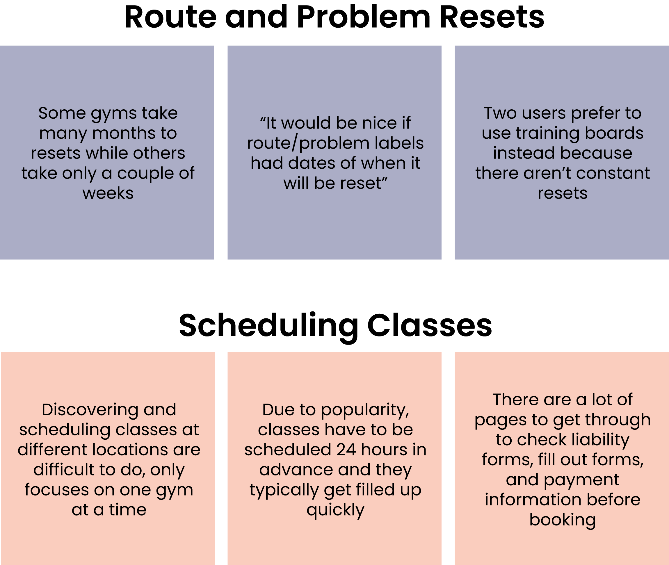
Knowing when rope route and boulder problems resets would be extremely helpful for all of the participants because it allows discipline and time management to work on projects.
7 out of 9 participants have plateaued and find it frustrating and hard to get to the next climbing level.
RGPro’s class scheduling system is difficult to use due to the many steps taken to book a class and on top of that users stress having to book 24 hours in advance to secure a spot.
User Personas
There are two different types of users that I wanted to target: a climber who is trying to become a stronger climber and the other is a climber who is using their membership to the fullest by visiting different gyms and booking all of the classes available.
Customer Journey Map
To better understand how both personas would interact with the climbing gym and how it translates into using the application, I explored a customer journey map to recognize pain points and discover opportunities. The ambitious climber would typically get frustrated with their plateau, so features that promote growth could be useful for them. The gym hopper wants to do more than climbing by checking out classes, so streamlining their booking process will alleviate any of the stress and frustration they have.
Please click on the individual images above to see the customer journey in full detail.
Problem Statement
Not knowing when rope routes and boulder problems are going to be reset is one of the biggest pain points for climbers. This leaves them frustrated if they have to continuously working on the same things over and over again, leaving them feeling tired of going to the climbing gym. If we keep climbers informed about route and problem resets, this can give them a better understanding of the amount of time they have to allocate to a project.
“How might we prevent facility fatigue and enhance our members’ experience at the gym?”
Define
Feature Set
01. Reset Countdown
Seeing climbs and when they reset will be the most important feature for this application. Users can review routes and boulders before they even get to the climbing gym and will have full transparency on when it will be reset. They will be able to save these climbs and organize their time well.
02. Class Schedule
Many, if not all, climbing gyms offer classes to their visitors such as yoga, cardio boxing, and climbing classes. For gyms that operate in many locations, a class schedule as well as a way to set an alarm will be useful for those who like to do more than climbing at their gyms.
03. Activity Tracking & Challenges
To help users get out of their plateau, it could be helpful for them to track what climbs they do and note how to improve. Climbers can push themselves when they are able to see how many climbs they’ve done at a given time. In addition to activity tracking, challenges can improve a climbers ability such as moves or speed.
Information Architecture
I performed a card sort to understand the mental model of an average climbers and created the site map seen below. The main focus of the information architecture is for users to log activity for a climb. Climbs and activity logging can be seen in multiple sections of the application.
User and Task Flows
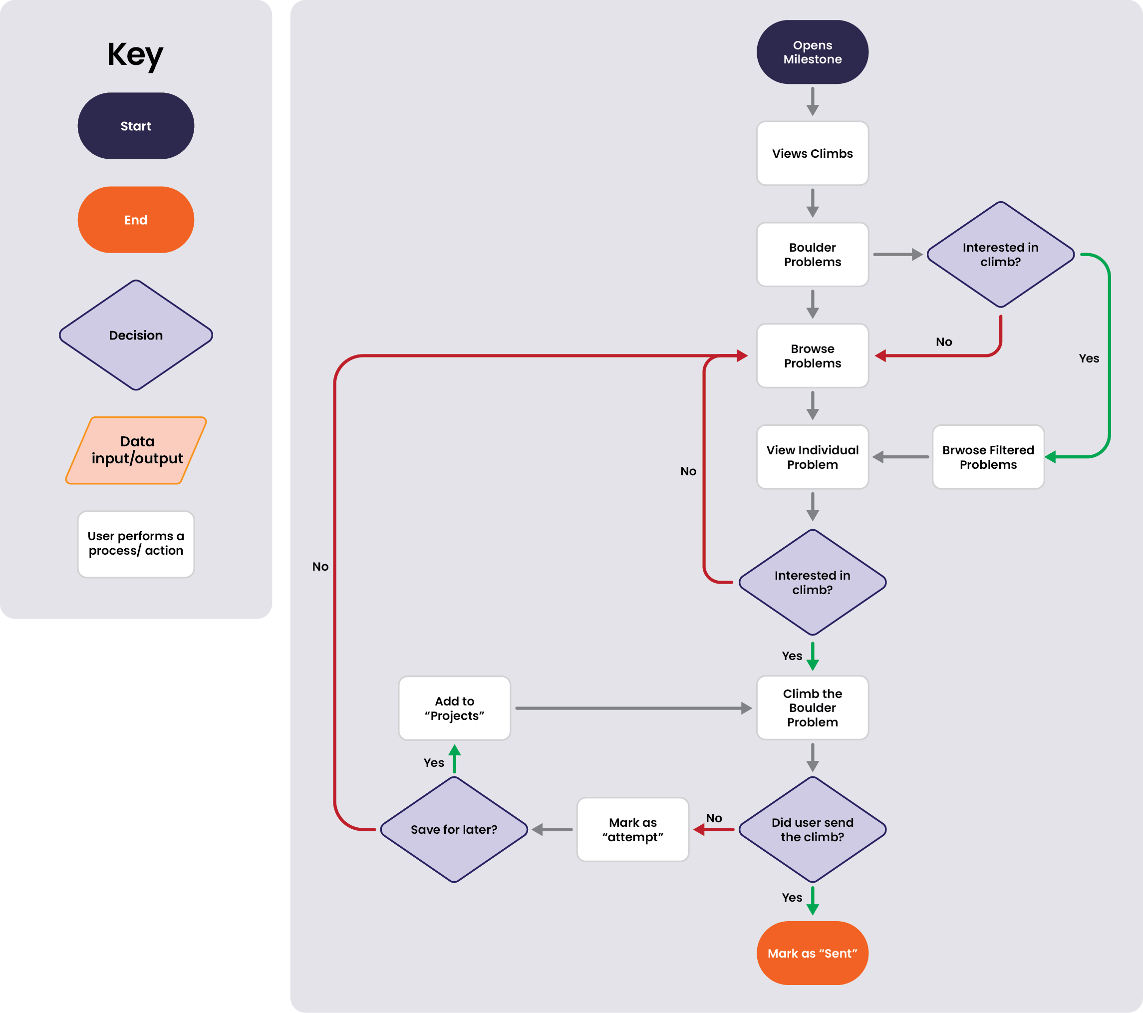
I created this user flow to understand what steps users would have to take in order to log activity for a climb. Navigating to the rope route or boulder problem was simple, but the activity logging and saving a project for later was a little more complex.
Brand Identity
Developing the Milestone Brand
The core values of Milestone are inclusivity, empowerment, community, collaboration, transparency, and growth. Climbing gyms provide pleasant experiences within their community with their events, competitions, and friendly staff. The members of this community itself are always helping each other grow through empowerment and collaboration. Because of this welcoming and creative atmosphere, Milestone’s goal is to translate that into a mobile application that will help give users that same experience.
LOGO SKETCHES
INSPIRATION AND REFERENCES
THE LOGO
A common pose that climbers strike when they complete a climb is they will let go of one hand and ball it up in a fist and flex. This signifies the strength and problem solving skills it took to finish a climb. This imagery represents how the climbers will grow and reach the next milestone in their climbing career.
For the colors, I used orange and purple to help communicate the brands core values. Orange represents friendliness that comes from the inclusivity and climbing community. Purple to represent the creativity and problem solving skills that climbers build as they collaborate with other climbers.
THE UI KIT
Design
Low Fidelity Wireframes
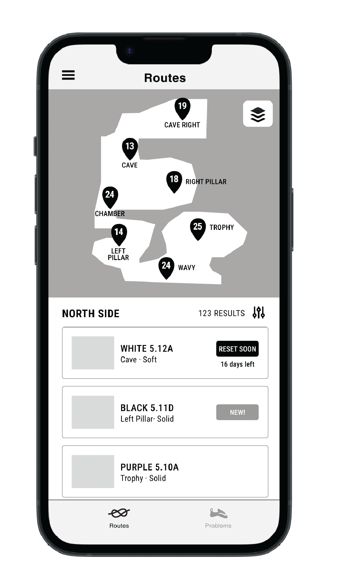
The user flow is showed how users would discover climbs and log the activity for the climb, so I opted out having a dashboard. The reason being we want users to get right into it without having to click on any additional pages to perform these actions. For the rest of the screens, different layouts were sketched out, but ultimately I wanted to choose what was the most intuitive and let usability testing do the rest of the work.
Map and Navigation Explorations
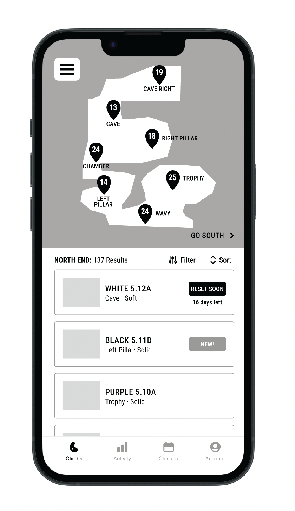
The biggest challenge was coming up with the map, navigation, and sub navigation designs. I didn’t want to choose an simple and small one floor facility because I knew if bigger gyms are going to be involved that I need to focus on the complexity of this feature anyway.



Mid Fidelity Wireframes
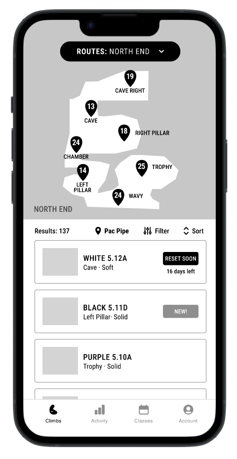
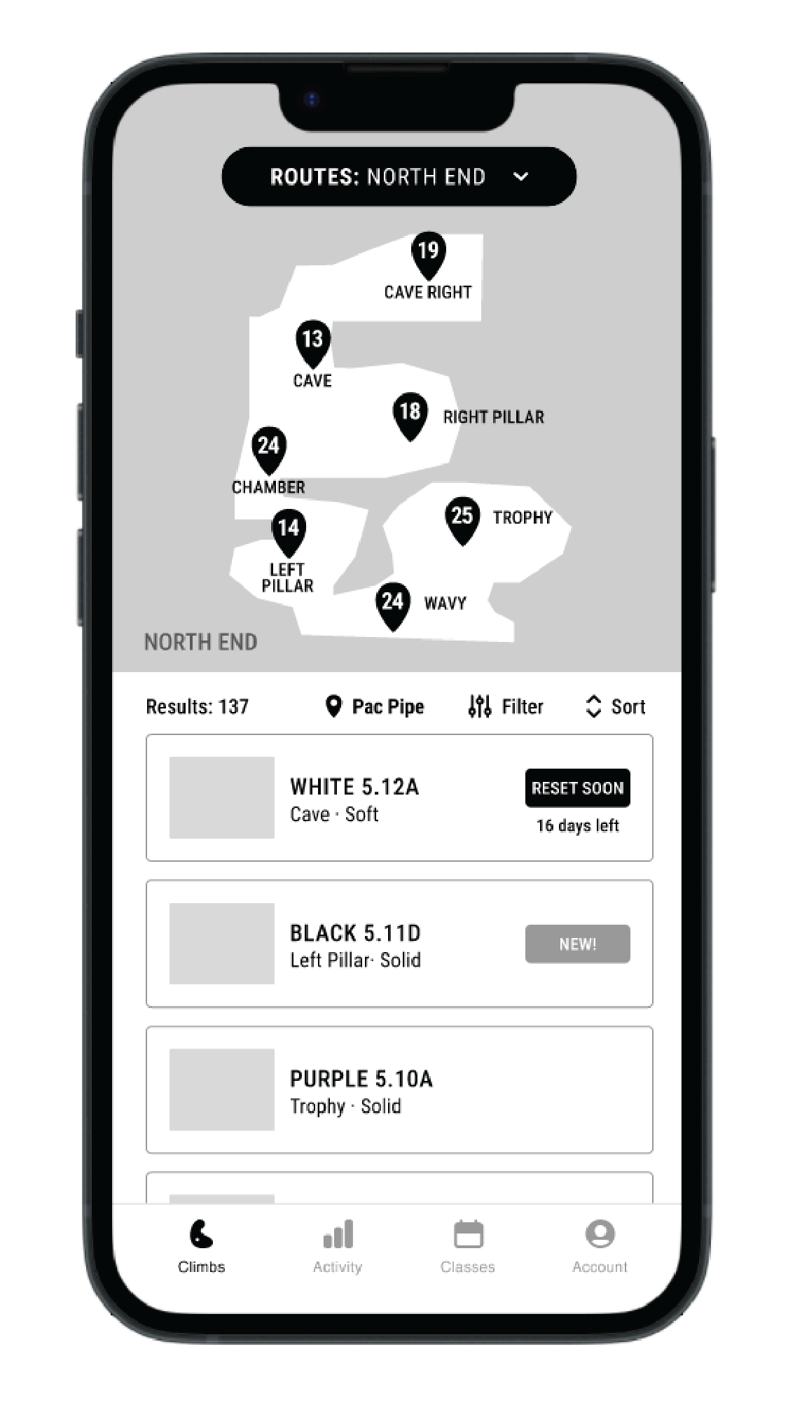
After exploring all of the different navigation options, one that stuck out aesthetically and functionally was the pill shaped drop down menu that allowed users to choose between routes and problems. Designs for the rest of the application came together naturally once deciding how the map should look.




Testing
Mid Fidelity Usability Testing
Goal
I wanted to make sure that the app was easy to navigate and discover further improvements for all of the features.
Tasks
Navigate from routes to problems using the navigation
Navigate to specific wall and climb using the map
Save a climb to projects then find projects screen
Log a send
Key Takeaways
After conducting the test with seven climbers, the biggest issue with the application was navigating the map. Users tried to click in the map area or filters instead of the navigation. Thankfully, I purposely chose the biggest gym with floors, different sections, and both ropes and boulders to test how a user would interact with maps as complex as the one at Pacific Pipe in Oakland, CA.
A lot of users also found the lack of a dashboard screen jarring and weren’t sure how the app would know where they were. The other pages such as the account and activity lacked clarity of what is supposed to be on those pages. Lastly, all users had an easy time navigating the class scheduler, but they wished there was a way to set notifications for the classes as well as adding it to their personal calendars.
High Fidelity Wireframes
Major changes were made to the map and navigation due to all of the confusion and disorientation of the participants. A dashboard was added along with a page to navigate to all of the gym locations because I was asked how the app knew where they were already.
Adding a Dashboard
Due to the jarring first screen as well as confusing placements of certain features in the app, the dashboard was added to contain all of the out of place features. Because of this, I had to adjust the navigation.
Changes to the Map
In order to help users get oriented to the map, upon opening the gym, it shows a full view of the facility then zooms into the first floor area. Location markers are added such as the front desk and stairs to add more clarification of where a user is at in the gym.
Adjustments to the Climb Page
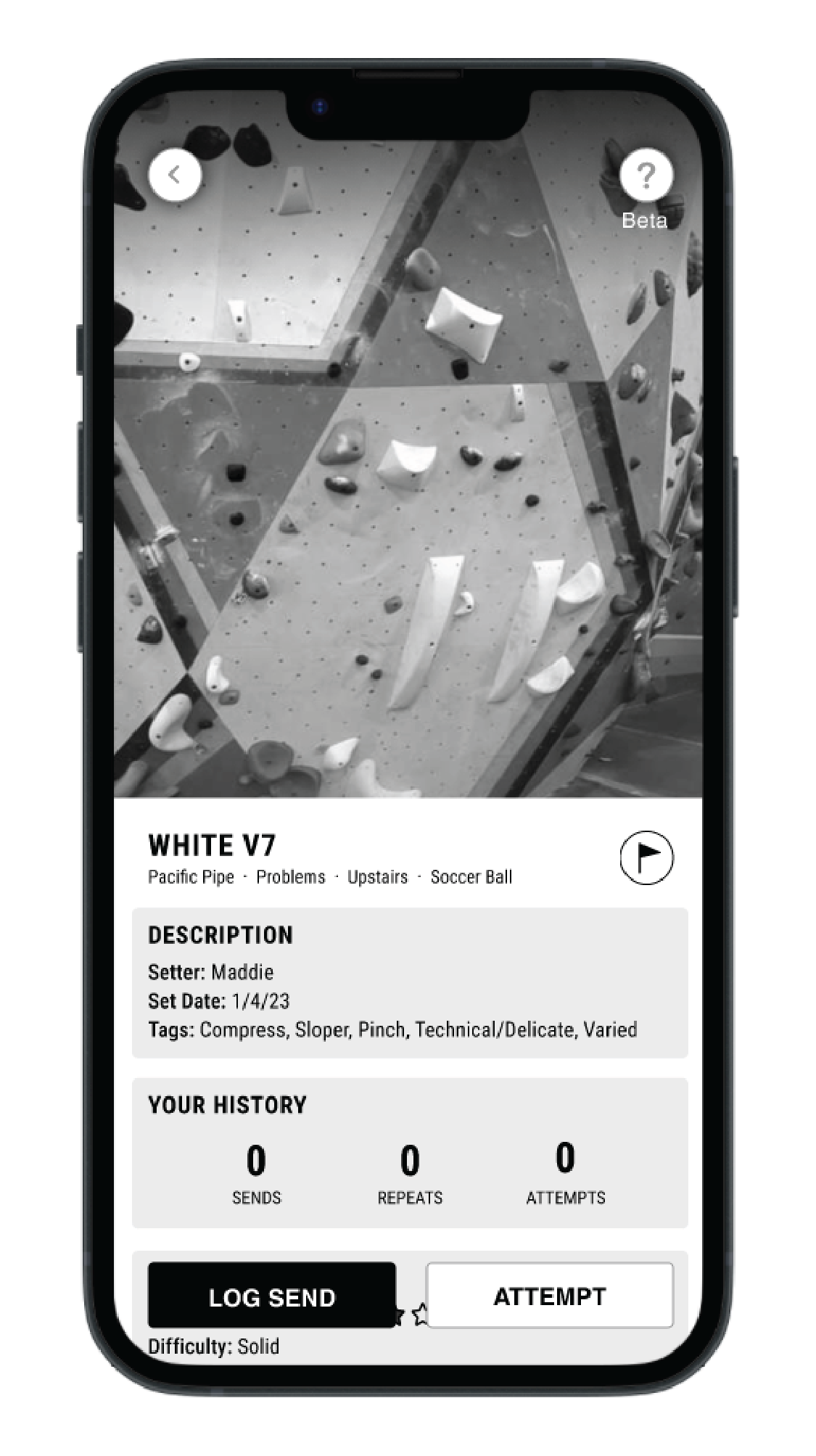
To make the climb page more clear, adjustments were made based on observation and usability feedback. The flag in the mid-fi for example was hard for people to identify so I made it clearer by making it say “+ Add to Projects.” Another thing users mentioned wanting was a way to add notes to remember what moves or mistakes were done.
Hi Fidelity Usability Testing
Goal
I wanted to test out the new navigation and map designs to ensure usability and also test out the reallocation of features throughout the dashboard and profile.
Tasks
Navigate to Pacific Pipe from the dashboard
Navigate to the orange v6 on the soccer ball wall then log a send
Set a reminder on a class and book it
Key Takeaways
The updated map was easier for the seven users to navigate this time around, but some still had issues navigating from the bottom floor to upstairs, possibly due to the placement and design of “View Upstairs”. They still tried to click in the top of the map area and filters, so this is something I’d like to continue to test to make it as easy as possible for Milestone’s users.
Another observation is that users would try to navigate to Pacific Pipe using the “News from your favorite gyms” or “projects” on the dashboard rather than the Climbs page. Because of this, I’d like to add quicker access to gyms from the dashboard and test this out in the future as well.
Results
Prioritization of Iterations
After testing the hi-fidelity screens, these are the changes I would do next for the next iterations.
Add quicker access to the user’s favorite gyms to the dashboard
Update the top and bottom floor buttons to be more visible
Move buttons on maps to the top of the map since a lot of users tend to click in that area
Reflection
From the get go, I knew that creating the facility map and navigation was going to be the biggest challenge. I purposely chose one of the more complex facility maps to design in order to find what would work best for similar facilities with the same set up. If it my solution worked for a bigger facility it would be fool proof for a smaller one. This was a challenge I was willing to take on because I knew that usability testing would give me better insights on how to make iterations.
Many designs were explored before my mentor and I decided to go forward with the one that felt the most intuitive. The results from both user testing results showed that it wasn’t intuitive and there was and is still room for improvements. Even after simplifying the navigation some users still struggled to perform certain tasks, so I’d love to continue iterating and testing the map and navigation.


